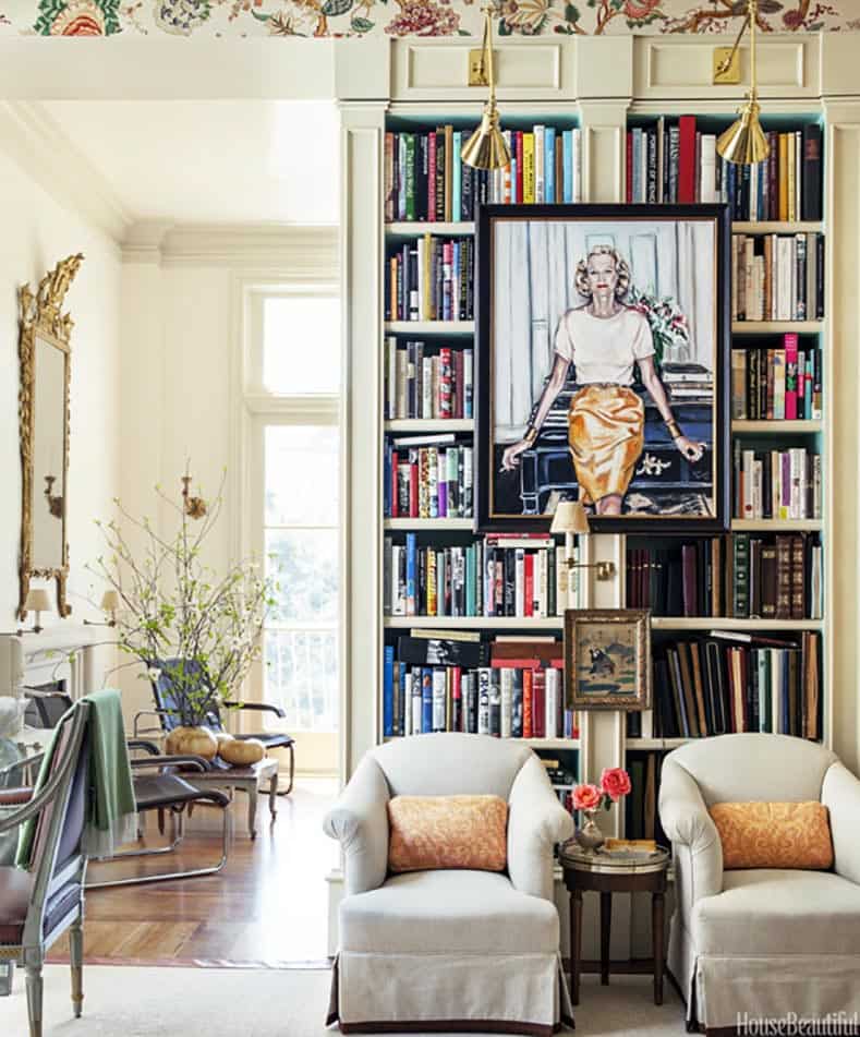
Agreed. I also feel like the jars, while cute, are maybe too small for the cubby on their own and could be cute on top of some sideways books?
What this is missing most for me is a plant! Even a fake one could be nice.
Would you switch out the fake flowers for a plant or add a plant somewhere? I have some spider plants on the patio that would love to move inside lol
Oh that would be perfect! They kinda have trailing parts, right? Yes, swap with flowers I think.
Just rub it in why don’t you.
I would replace the fake flowers with a spider plant.
Take a large hardcover book like that green and pink one, stick it under the horizontal stack in the middle row, and put one of the small jars on top.
Pull in any other hardcover books you have in other rooms, take off the jackets, and scatter them around the shelves, both vertically and horizontally.
Look for any other items with interesting shapes that could be used as little sculptures or bookends.
I would stick with wooden frames and add a larger frame with art that can leaned up behind a couple smaller objects. Does the top of the bookcase show? You could add an even larger-scale frame there, with a spider plant in front trailing down the side.
In general, groupings of odd numbers look the best. So if you’re going to group jars, do 3 or 5, and vary the heights. Other helpful tricks: layer objects in front of each other, and stack things on top of other things.
From the queen:
Thanks!! I’ll will work on this and report back.
…haha I just opened up zoom and my face blocks 90% of the shelves so I guess making it pretty is more for me than anything else!
Still important!
I uh drew up an example layout.
If you want to take pictures of the additional items you pull together, I can help place them!
I also really like the unexpected look of putting a picture frame in front of shelves, which helps break up the grid.
I would probably do that here:
Or a really big one right in the middle.
Would anyone be up for helping me find some ideas for the spare room in my new flat?
I say spare room - it has to serve a lot of purposes, so I’m fairly constrained on what’s going in it. The plan is to have a daybed (with a trundle bed underneath probably to fit two people if necessary) made up to look as non-bed like as possible most of the time, and then my current desk (white tabletop on top of two wooden pedestals) most of the time - then if people come over for dinner, pull out the desk into the centre of the room and get some folding chairs out. I’ve got sketcup mockups of what I’m thinking at the moment - the drawers, chair, blue cushions and red chair I have at the moment (the red chair could probably be switched out for a different colour if necessary - it cost me £10 on gumtree so I could resell and buy an alternative). I also have a large collection of paintings and the ability to make more, so there will be some art in there but not quite sure which colours etc. I also have a commemorative rowing blade that I might put up which has a wooden handle, and a lilac spoon
Basically, I’m not sure how to make it look cohesive. I’ve leant on rugs for this in other rooms, but I feel like a rug is probably not going to work with moving furniture around (from both a nice placement, and a this is inherently going to get all rucked up point of view). I’m wondering aboutmaybe some bold monochrome wallpaper on one or more walls that I could still put ? Or maybe paint some geometric shapes on the walls around art (the rowing blade would have to go diagonally which could work with that- very quick mockup below)
Send me your most fun ideas please!
I feel like I should be able to come up with ideas for you, but my design energy is very depleted at the moment. Sorry about that!
I will say if I were in your shoes, I would still probably use a rug. Perhaps just one meant for a higher traffic room?
Hello! Is anyone willing to offer input on selecting a new duvet cover for my bedroom?
I thought I had made this decision when West Elm had a sale and I ordered one in what they call light pool blue. However, now for the second time ordering a supposedly “in stock” item from them online during a sale event, they decided to simply not fulfill my order or even tell me there is a delay. It’s been 1.5 months, so today I was tired of waiting and officially cancelled it.
Now I’m looking at eBay. I could buy the same one I ordered there for about $20 more than I had planned. Or, for significantly cheaper, I could get the same pattern in gray.
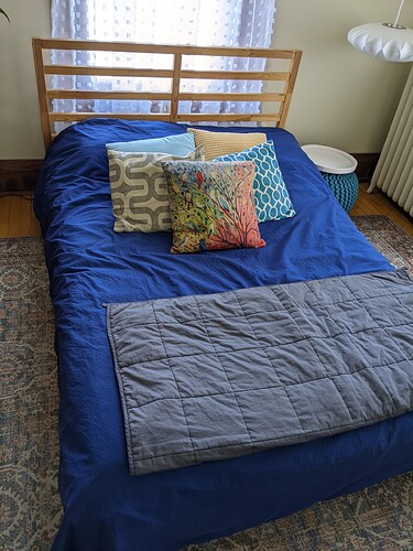
I’m including a photo of my bed. My rug has a variety of oranges and turquoises. I have quite a bit of orange, teal, black, and white in the rest of the room with cream walls and dark wood. I tend to love a lot of bright color which is why I picked the blue. But maybe I already have enough color and the gray will be pretty? Thoughts?
My thought is choose what you really love since you’ll be looking at it a lot.
I’d go the blue!
There’s this, it’s on sale too.
Of course, you could hate that too!
I can’t tell if I dislike it because it’s unfinished, or because I need to add more green, or just because I don’t like the green with the stark white. I’m going for a woodsy vibe, but didn’t want to make it too dark.
If it were a powder room or second bath, I would paint the whole thing dark green. Instead I’m thinking I should paint over the white with something else that’s still light but not such a stark contrast.
I can’t tell if it’s just the photo and looks different in person but I feel like a shade or two lighter in the green would be better, yeah. Caveat that I don’t actually know how much a “shade” is.
Oh I’m actually happy with the green. It’s the white on top that I don’t love.
Maybe go to a cream or light gray? Will you paint the window trim to match the top part?
Ooh grey! Yes! I was thinking I would put cream with it but I was worried it would clash with the white trim, but grey could work very well.
Could you add a picture rail sort of moulding, to make a better distinction??


